
UX, short for user experience, is a multidisciplinary approach that attempts to identify the way users feel about using (or anticipating using) a product, system or service, in order to manipulate these reactions.
Though most people referring to UX think of the process in terms of design work – for example, whether the look and feel of a web page design creates a positive impression on visitors – it may also encompass conducting market research, running split tests on proposed changes and analyzing data.
But at its core, UX is about understanding the way something makes users feel, as it is these feelings that provoke users to action.
A clean, modern mobile app user interface (UI), for example, might subconsciously signal to users that they’re buying into the latest hot product, reinforcing their notion of themselves as first adopters.
Alternatively, a law firm website design that uses rich colors and stately design elements can convey the image of prestige and power to those seeking legal services. Telegraphing these signals to users can reduce their resistance to calling the law firm, as they may feel more confident that they’ve chosen the best source of assistance for their needs.
These effects have powerful implications for your content marketing strategy.
While content strategists don’t necessarily report to UX designers (or visa versa), the two groups can improve both of their results by working together.
Developing content pieces that follow established UX principles and creating user experiences that incorporate strong content give businesses the greatest chance of succeeding in today’s competitive online environment.
Lesson #1 – People remember how you made them feel – not what you gave them
Think back to a really great gift you received. When it comes down to it, are you thinking about the physical gift itself or the way you felt when you ripped off the wrapping paper and held it in your hands?
In the world of UX, it’s well accepted that how you make a person feel ultimately matters more than what you give them. This applies to products you sell, as well as any content you give away.
Take, for example, the free ebook provided in exchange for an email newsletter opt-in. I think it’s pretty safe to say that this technique feels a bit played out, given the number of shady websites that abused the process by delivering low quality PLR or scraped content guides. If you sign up for a newsletter and receive one of these books in exchange, it’s a safe bet to say that you’ll be left feeling disappointed!
But sites that deliver poor value content leave the door open for brands and businesses that are willing to invest in doing things right. Take, for example, Danielle LaPorte’s Desire Map product line. Instead of tossing some cheap, cheesy ebook at her subscribers, LaPorte provides an entire media library, complete with downloadable recordings:
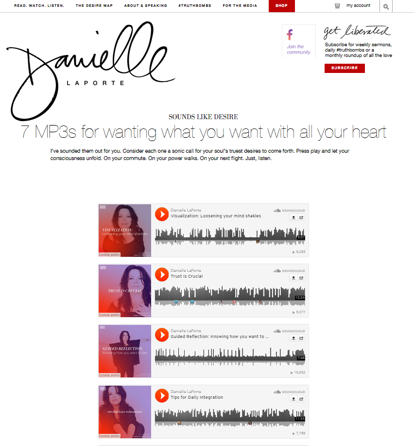
LaPorte’s subscribers feel like they got a great value for their subscription action, and in return, these good feelings translate to LaPorte herself. It’s a win-win for her and her followers.
Lesson #2 – Fix your website, then look at your content
Of course, it’s a safe bet to say that all the great content in the world won’t matter if its intended recipients can’t even access it! Website accessibility issues are one of the biggest problems plaguing user experience, so ask yourself the following questions before investing heavily in content marketing:
- Does my website load too slowly? Even load delays of a few seconds can frustrate users, causing them leave prematurely with a negative perception of your brand.
- Is my navigation clean and easy to understand? If it takes your visitors more than three clicks to find the information they’re looking for, you’ve got some work to do in terms of making your website more accessible to visitors.
- Have I emphasized high priority information? If you run a brick and mortar business, it’s a safe bet that a fair number of your visitors arrive on your site looking for your address, your hours of operation or your contact information. So don’t make them work for this content! Instead, emphasize it in key areas on your site to create a positive user experience.
- Is my text difficult to read? Certain fonts, as well as certain combinations of font and background colors, make it difficult for visitors to read your content. Stick with high contrast combinations and clean serif or sans-serif fonts.
- Are my colors and visual elements appropriate? We’re well past brightly colored GeoCities site and animated GIFs. Odds are, if you’re using more than 2-3 primary colors on your site (or if any of those colors happens to be fluorescent), it’s time for a design update.
- Is my site mobile accessible? Some 60% of internet traffic now comes from mobile devices. And no matter what type of business you run or what industry you work in, attempting to access the desktop version of your site on a mobile phone or tablet is going to be frustrating! Get with the times with a new responsive site design that will better accommodate your users.
Lesson #3 – You can’t create a good user experience without great content
Now, suppose you’ve addressed all these website issues and created a welcoming environment for your visitors. Well, guess what? They’re still not going to stick around if you don’t pair the good user experience you’ve created with great content!
Let’s look back at the example provided above from Danielle LaPorte’s website. There’s no arguing with the fact that her site design is clean, accessible and likely to resonate with the visitors who come to her website seeking motivation and guidance.
But great graphics only get you so far. If LaPorte’s content didn’t live up to the standards set by her user experience, there’s simply no way she could continue to be popular in the competitive lifestyle design and life coaching space.
You can apply this same principle to your website. Suppose you’ve done the work of making sure your site conveys your desired user experience to your visitors. Look next at every piece of content you’ve created that supports this perception. If you can’t emphatically say that each piece lives up to the standards you’ve set for yourself, re-do it.
Lesson #4 – Don’t build content for content’s sake
Of course, as you conduct this analysis, keep in mind that there are situations where content may not actually be called for.
Today’s digital marketers are so enthusiastic about content marketing that it’s tempting to believe all of your problems can be solved by developing and deploying new content pieces. But think back to the example mentioned earlier of the new mobile app with the clean UI. Do app users really need tons of blog posts, infographics or interview clips? Maybe not.
Users of the app don’t really want to ingest a ton of content – what they want is to get up and running with the app as quickly as possible in order to take advantage of the benefits it offers. Content might help users achieve this goal, but other activities – like refining the onboarding process or adjusting the UI for clarity – might do so faster.
Don’t assume that content creation is the answer to every problem you encounter. Instead, carefully assess your users greatest needs and focus your energy on the solutions that will best meet them – whether or not they involve creating new content.
Lesson #5 – Get to know your users inside and out

Suppose you’ve been told that you need to buy the perfect birthday present for your boss’s wife, but all you know is that she’s female, turning 45 years old and likes reading. Would you get her a mystery book? Something non-fiction? Or maybe a lamp to let her read at night in bed?
The problem is, you can’t buy her the perfect present because you don’t know much about her! It seems intuitive, but plenty of website owners approach user experience and content marketing in the same way. If you don’t know your users inside and out, how can you assume that the experience you’re building is the one that’s most likely to appeal to them?
The solution to this issue is to create buyer personas that help you to visualize and better understand the people who are visiting your website and what they want.
We’ve talked quite a bit about creating and using buyer personas on the Single Grain blog before, but what you need to know is that these tools can make websites 2-5X more effective by enabling site owners to deliver more targeted experiences.
Give them a try today if you haven’t already!
Lesson #6 – Account for snap judgements by making a great first impression
Want to hear something fascinating? According to Google, new website visitors form “gut feelings” on new websites based on their visual complexity (how complex the visual design looks) and its prototypicality (how similar the site looks compared to others in its category) in just 17-50 milliseconds. For comparison purposes, the average blink takes 100-400 milliseconds.
The truth is, we all make snap judgements – and both your website’s user experience and content contribute to these first impressions. So knowing what we do about the impact visual aesthetic and expected UX structure have on initial perceptions, how can we apply these lessons to our content strategy in order to ensure that our visitors’ first impressions are positive ones?
As contradictory as it seems, the solution is to be novel, in conventional ways. Research suggests that novelty excites different parts of our brains, leading to stronger interest and better engagement. But if prototypicality plays a role in user impressions, you must balance being both novel and conventional – and you can do that with your content.
For example, you could try keeping your website’s design in line with conventional expectations, while also using unexpected language to provoke interest. You might also try turning conventional content forms on their heads, as Truscribe and other manual animation companies have done with traditional videos:
Just don’t use the evidence supporting prototypicality as an excuse to be boring. While maximizing first impressions is important, your content campaigns stand to benefit more in the long run by being disruptive while still carrying conventional signifiers.
Lesson #7 – Improve focus by limiting choices and minimizing distraction
It’s well established among researchers and UX workers that having too many choices leads to more negative outcomes. In one often-cited study, researcher Sheena Iyengar tested the impact of placing either six or 24 jam pots on display at a California gourmet market booth.
Interestingly, while 60% of customers were attracted by the larger display, only 3% went on to purchase a jar. Although only 40% of customers stopped by the smaller display, 30% of those who sampled went on to make a purchase.
This isn’t to say that too much choice is always bad – just that having more options divides our attention and distracts us from moving forward. If you had sampled only one jam out of six and liked it, you would be much more likely to assume that you wouldn’t be happier with another alternative than if you were confronted with 23 possible better selections.
For these reasons, UX employees work to limit choices in certain situations in order to focus user attention on the truly important elements. Content marketers can adapt this line of thinking in a number of different ways:
- Stick to a single topic within each content piece – Suppose you’re writing a blog article tackling the recent proposed minimum wage hikes. That’s a pretty big topic, and you could cover anything from restaurants that already pay a living wage to economic research supporting both sides of the argument. But presenting multiple topics leaves readers with several choices when it comes to determining the key takeaway from the article. Honing in on a single point will keep readers more focused and more receptive to your main point.
- Limit the number of content pieces presented at any given time – Take a look at the way you present content pieces on your website. Does your blog’s landing page scroll on and on, presenting snippets of ten, twenty or even more posts? Does your video library display dozens of videos at once for users to choose from? If so, try scaling back the number of options shown up front and see how your on-page engagement rates change?
- Give users a starting point – Plenty of websites have separate “Start here” pages or text and design signifiers that tell users where to begin exploring a site’s content. If your site doesn’t yet take advantage of these features, try adding one or more today by determining where confusion is most likely to exist and what content pieces will best solve the issue. Don’t just trust that users will figure out where to go on their own – show them what to do by presenting a single content recommendation.
Clearly, there are plenty of parallels between UX work and content marketing, so don’t think of this list as exclusive. If you’re serious about taking your content campaigns to the next level, invest some time in the study of user experience.
The more you’ll learn, the more powerful lessons you’ll encounter that will help you to attract new readers and convert them into lifetime customers through your website’s content.
Image: Flickr